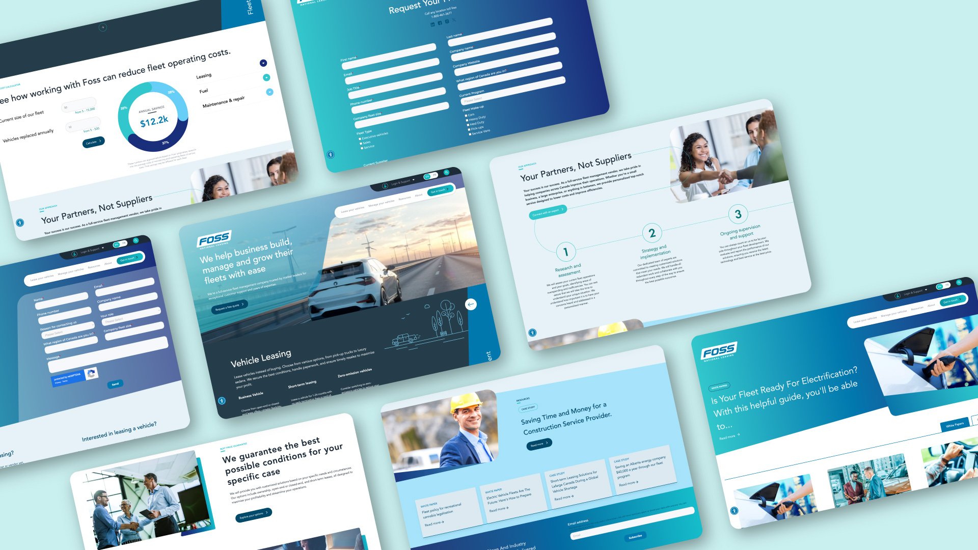
Crafting a website to highlight expertise and competitive edge.
Foss National Leasing (FNL) is Canada's largest privately owned fleet management company, and it manages some 50,000 vehicles.
I drove the UX strategy and design for the website redesign, making sure that every design choice was in line with Foss's values and brand identity. We created a website that effectively communicates Foss's value as a comprehensive fleet mobility solution, while also ensuring that the website is a helpful and intuitive resource for customers.

Opportunity areas
Showcase value
I worked closely with the business to understand its unique approach to fleet management and present this on the website. My goal was to make its value clear to both entry-level and experienced fleet managers by simplifying service offerings and highlighting its expertise.
Support and be helpful
Foss aimed to uphold its brand value of 'Your success is our success' by creating a website that serves as a valuable resource for prospects and clients. My focus was on designing a solution to support users in making informed decisions and accessing information that would help them in their role.
Showcase value
Positioning FNL as a comprehensive fleet mobility solution
FNL is more than a vehicle provider or leasing company. To convey this, I refined the service offerings to highlight Foss’s unique blend of advanced technology and expert support. This shift in positioning was crucial in distinguishing Foss from competitors and aligning the website with the company's strategic goals.
Showcase value
Simplifying service offerings
The original website had 25 services, which diluted the company’s core strengths. I facilitated workshops with the business teams to identify what Foss does best and why customers choose them. We streamlined the service offerings to 10 key areas, making it more intuitive for prospects and customers to understand and engage with Foss’s services.
Showcase value
Fleet and fuel cost calculator
To demonstrate Foss’s value, I integrated a fleet cost and fuel discount calculator into the website. These tools allow potential clients to see how working with Foss can reduce fleet operating costs, directly leading to further engagement and inquiries.
Support and be helpful
Navigation and wayfinding
I prioritized simplicity and clarity in the site’s navigation. We clearly categorized services and highlighted key offerings, such as “Manage your Fleet” and “Lease your Vehicles,” as core service groups.
The menu includes hints and subtext to help new users understand the offerings at a glance. As well as, FAQs and the search were designed to be user-friendly and informative.
Support and be helpful
Vendor network locator
To further help our customers we integrated a vendor network locator into the portal, enabling users to find fuel and maintenance vendors near them. This feature is a resource many of our fleet manager customer use and value.
Support and be helpful
Educational resources
Recognizing the need to educate prospects and clients, I ensured that the website serves as a valuable resource. We included case studies, white papers, and other educational materials that make it easy for users to learn about fleet management specific to their needs.
Some things I learned.
I needed to strike a balance to ensure the design was intuitive for both newcomers and experienced fleet managers. The goal was to make complex information accessible without oversimplifying it.
It can be challenging to get clients to articulate what they do best or their unique strengths. Asking questions to help them see their own value more clearly. This approach helped the client step back and define their special sauce, which then allowed for a more focused and effective design strategy.


